Before I started getting into mixed media art I was a quilter. So from a machine quilting practice piece that I still had I was able to make this tag. The other thing I like to do and still do is hand embroidery and hand quilting big stitches with embroidery floss and perle cotton.
I started out with a quilted tag that was ho hum so I used some watercolor paint to give it some life. Here's a before and after of the quilted pieces to give you an idea of the difference a little paint makes. The paint dries to a lighter color. The top picture shows it still wet.
A small piece of fine white cotton muslin was lightly painted and the words were stamped with brown permanent ink. Behind it was some white open weave textured ribbon that I also painted.
Another detail of some stitching and some ribbon and a small chipboard circle from Altered Pages that I painted as well. Those little chipboard circles and sprockets sure come in handy for a variety of projects
Here it is straight on or should I say a little crooked. The piece of muslin with the words "is for Quilt looks like it's going downhill. Oh well, I'm striving for a perfectly imperfect look. Right?
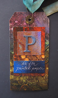
N is for Note, O is for Ornate and P is for Painted Paper
The word ornate seemed like a good word to use for the letter O but I found it very challenging. It started out fun when I took some sparkly metallic watercolor paints and colored some embossed specialty paper. Well it turned out so pretty I didn't want to cover over it but I had to. So I fished around in my supplies and found a swirly thing-a-ma-bob and painted it with gold metallic paint and some more of the sparkly watercolor paints so it would sort of match the background. Then I had this big fat chipboard O which was very plain so I ran it through my Sizzix machine inside an embossing folder. Then more gold paint. Well you can't put that over a busy background so I put both onto a reddish purple rectangle of paper. The words were printed, cut out and inked. Phew! That one was a pain!
This one is my favorite one out of the three tags. All the backgrounds were cut from textured and painted paper I made last year. The background for the words and the letter P come from the same paint - lucky I still had some left over. I wrote out the words with a white gel pen. For me, it's all about the color!
M is for Masking
For this tag I used a Gelli print that had been printed with a leaf branch. The color you see is the original color before the red paint was applied over the mask. The outline of the branch was accented with a little purple to make it stand out. I'm not too crazy about my M or my lettering but I must push on to the rest of the alphabet!
On to J, K, & L alphabet tags
Moving right along we come to J is for Journal which was made from different scrapbook papers and joined together into a sort of tag booklet. I used a little charcoal paint to the front page with a sticker letter J and wrote the words with a pigma pen.
K is for Kick used a green gelli print background with a gypsy image over that and some punched circles from a red gelli print. I then used those same paints to paint the letter and corrugated paper. A scrap of the background was used for the words and written also with a pigma pen.
While antiquing in Pasadena recently I came across some beautiful vintage black lace that I had to have and so I used a piece of it for my L is for Lace tag. Gelli prints were used for the background and words. I added some black and white polka dot washi(?) tape behind the words a a teeny scrap of paper in the same print to use for the eyelet.
My alphabet tag series continued...
Man it's been ages since I posted but then I've been busy with posting for Altered Pages and taking mini vacations this month. So without further ado I will go on to the next letter in my alphabet tag series.
G is for Gelli printing was made with cutouts from different Gelli prints
including the chipboard letter. scalloped edging and the eyelet flower.
I used some specialty paper from the art
supply store and painted it with a charcoal grey.
The owl image was cut
into an oval with yellow paper behind and
cut with postage stamp decorative scissors. I designed the words in Publisher.
I is for Itsy Bitsy Inchies was inspired by my friend Rita who had just done a recent inchie art swap. Again, a Gelli print was used for the main background as well as the inchies.
Subscribe to:
Comments (Atom)


