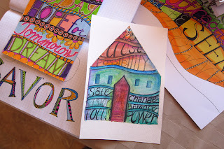
Upcycled houses part 1

I'm not sure whether to call this new venture upcycled or recycled houses but in a way it's both. I had some "green" kitty litter that I knew the cats probably would balk at and for that matter I'm afraid I'm too used to scoopable litter so I'm using it along with those annoying plastic grocery bags to fill my little houses which will be made from recycled cracker boxes.

A few years ago I came across Bella Dia's cereal box house tutorial and was so inspired that I thought I would try to make some of my own. There were a few modifications I made from the instructions such as don't score along the line on the front and back sides of the house or you'll get an indentation like this...

...which won't resolve itself with several coats of Jerry's gesso. See the indentation at the roof line?  The other thing is that these boxes are made from flimsy cardboard and will cave in here and there from all that gesso. Turning it inside out seemed like a good idea but maybe the moisture barrier keeps the cardboard wet too long which might be the other problem. I did use a lot of water to smooth out the gesso but I think I'll sand it instead. I didn't get any shots of how I did the window - which took a little engineering - but I will on the next one. Meanwhile in the back of my head I'm trying to think about how I want to paint/decorate the houses. I'm open to suggestions as I will (hopefully) be making these to sell at a craft fair in early November! To be continued...

Thanks for stopping by!

Having some fun with lettering

 I've been  having so much fun practicing my lettering while taking Joanne Sharpe's Letter Love online class. These are a few of the many assignments. The letters below were sketched out with a fine black pen then filled in with doodling and colored with various markers.


Here's a word made from this style of lettering.

Thanks for stopping by!


Last but not least Y and Z

 I never thought I would get all the way to the end but here I am at last. It's all about doodling and lettering for these last two tags. This is something I've been practicing while taking lessons from Joanne Sharpe's Letter Love online class.

 The Y is for youth tag should have been youthful but I was concentrating too hard on the lettering and not the spacing but no big deal. It's cute and goofy which is okay by me. I used a .03 pigma pen, markers and mica watercolors. The little flower girl images from Altered Pages were cut from circle punches.

This zany zentangle tag was entirely done by pigma pen and markers with a little pencil shading. The "Z" was cut out and adhered with pop dots to make it stand out from the background. I have to admit I had my doubts at first about zentangles thinking it was too faddish and silly but once I devoted some time to it I did sorta fall into a trance while doing it. It's probably the best way too keep me quiet!! Don't tell my family that! These aren't the same doodles I've done in the past while in class or on the phone. These require some attention and focus which is something I'm usually lacking in. I really do enjoy it.

Thanks for stopping by and following along!

X is for Xylography


I know I know I'm stretching a little here but there's not a whole lot of art words that begin with X. But did you know that a xylograph is a term for wood cut block print? Neither did I. Fortunately I'm a proud owner of a wood cut block stamp set that I bought several years ago that was languishing in a drawer. When I used the stamp the first time I stamped in the usual way for rubber stamps but did not get a very good print. With a little research I learned that you get a better imprint if you place the paper over the stamp and rub into it with a spoon or something similar. I used Stazon black ink and colored it with some red mica watercolor paint and some Adirondack silver mixatives ink which I used as a paint. I really love how strong the silver came out. I'll be using that in future projects.

U,V,W, only 3 more letters to go!


 Well I'm heading towards the end of the alphabet and these letters are getting a little more difficult. The letter U was tricky but V and W had lots of possibilities.

 For the letter U, I chose upcycle which is kinda what I've been doing here and there along the way. I think I get the terms recycle and upcycle confused. How I understand it is that with upcycling you're taking something that you may not be able to recycle and make it into something useful or pretty. With recycling you or your recycle center are reusing raw materials such as paper, plastic or metal and making something out of it. You know I'm still confused about it. Oh well! For this tag I used a paper towel that I saved which had lots of pretty colored inks left on it from an old project. The letter U was cut out from a paint chip and the leaves and flowers were punched out from tiny scraps of yet more painted paper from my stash. It seems like I never throw anything out but my trash bin looks plenty full!

On to the letter V...
There were lots of great words to use like vintage, vignette, villain, vampire, Venus and so on. I was looking at my various collage sheets from Altered Pages and found this one called Vices. These vampy girls really fit the bill! I fussy cut 3 of the images and adhered them to some red scrapbook paper and some black see through mesh specialty paper. I made the gal on the bottom right stand out with pop dots. The chipboard letter was covered with tortoise shell print paper.

W is for watercolor is pretty self explanatory. I was trying out watercolor pencils and crayons with mixed results along with regular and mica watercolors. All 3 tags have those cute little light bulb safety pins at the top that I love so well.

The past couple of weeks I've been practicing my lettering from an online class by Joanne Sharpe so I've been adding my own lettering bit by bit. Hopefully I will get better as time goes on.

R is for Rust, S is for Soulful, T is for Texture

  I've been in love with rust, brown, camel, and turquoise colors this week and that is why these next 3 tags match. To me the earthy colors are reminiscent of the southwest where I live.

 In this first tag I gathered rusted fabric and used a couple of rusting embossing powders (Ranger Embossing antiquities rust and Tim Holtz Distress vintage photo powders) and while I love the look of the antiquities rust it didn't really look like real rust plus it was kinda shiny. The Tim Holtz one starts out looking shiny but the instructions tell you to lightly sand or rub into the embossed color until it looks more matte which worked better. So I used that for the eyelet and letter. Then I found these gorgeous looking brads called Vintage accents by Creative Charms at a local craft store and added those along with some scrap painted turquoise paper and painted ribbon. At the bottom I added some stripes of turquoise paint. The words were letters individually stamped in black onto a distressed brown background.

When I look at this wonderful image of a gypsy from Altered Pages she looks so soulful and dreamy. She doesn't need anything added to her because she's perfect just the way she is. This tag was going to be about stitching so the background is made up of various scraps of paper in similar colors stitched onto a background and then cut to fit the tag. I did distress the tag and in some areas of the paper to bring out their textures. The S is an old eyelet I had and I used Stazon brown and black inks to cover up the shiny silver. The words were written with a black micron pen.

 Here's another challenging tag that I thought would be quick and easy to do but ended up taking too much time. Just because the tag is small doesn't make it easier to do because you still have to think about composition, shapes and colors in a very limited space. Plus I fuss way too much and get nowhere sometimes! So there's a medley of textures in this one; painted corrigated cardboard, some kind of grass cloth, painted cheesecloth, and snakeskin textured paper. The "T" was covered with a brown leather like paper and the words were embossed on metal and then colored with Stazon brown and black inks. The eyelet sprocket was painted with the same craft paints I used for the cardboard; black, brown iron oxide (Ceramcoat), Laguna blue (Ceramcoat), and golden brown (Plaid).